 An all-new multi-service login for your PSPINC web apps!
 Request a quote for Custom WordPress Design

.png)
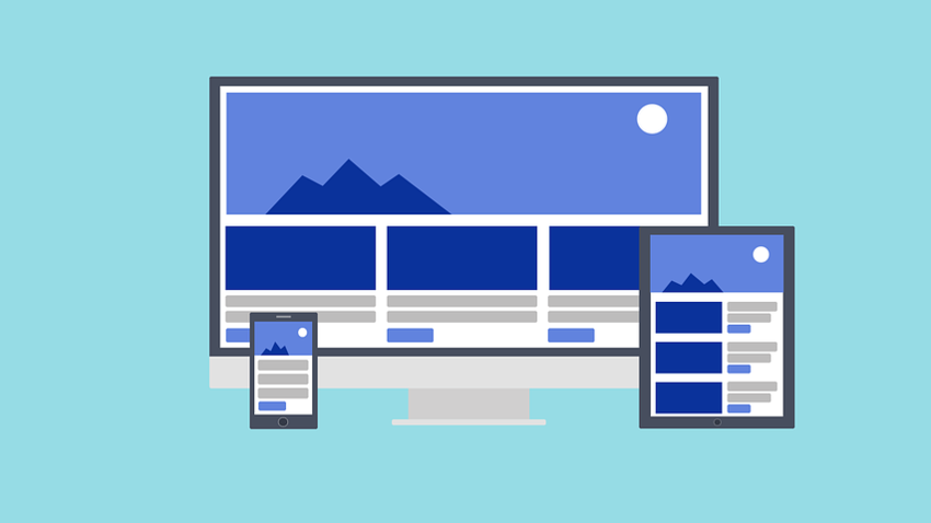
Responsive design is a technique used by web designers where the pages of a website “respond” and reconfigure to a mobile-friendly view on whatever device is being used. Not too long ago, designers had to create one website for desktop and a separate one for mobile. The mobile website was usually a watered-down version of the main site – but times have changed.
Even before Google announced mobile-first indexing, web designers were already transitioning to a single website that worked across all devices. They do this by using fluid and proportion-based grids that adjust their size by a percentage relative to the display size.
This type of web design has become the standard for how websites are built today. And this is because of the increase in smartphone and tablet users, which now make up over half of all website visitors.
One major issue that designers have to deal with when designing responsive websites is mouse vs. touch. A website displayed on a desktop is navigated using a mouse but mobile devices use our thumbs. Designers have to build a website that responds and adapts to the display size while still making the site easy to navigate.
According to a Pew study, 77% of Americans now own a smartphone, which is more than double the number of smartphone owners in 2011. If you track your website traffic, look at the devices that your website visitors are coming from. You’ll probably be surprised at the amount of mobile users. If you don’t have a responsive website you should consider building one to make the best use of it.
For more information about responsive web design watch our video below: